Abstraction to me can be seen in two ways, one is creating a piece so complex however it has a simple meaning and the other is reducing something to only the most important features yet you can still understand the thoughts behind with no need of explanation.
I have created an abstraction pinboard and added it to my Pinterest. It is a collection of images that are labelled 'abstract' and appeal to me.
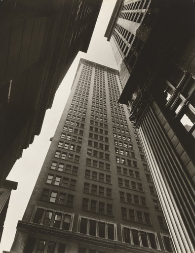
Formal Elements
|
In photography, formal elements are what we use to analyse the key features in a photo. These elements include main parts of an image such as the focus, the lighting, and the tone.
Other elements involve: -Shape -Space -Lines -Texture -Repetition |
|
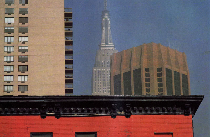
In my opinion, the area in the image that draws my attention the most is the red house running along the bottom the the photo. The contrast between the slightly duller structures in the background helps bring out the harsh red.
The light in the photo is distributed evenly across the buildings however, I see light being reflected in the windows on the left side and I also don't see any shadows therefore I believe when the photographer took the photo, the lighting, most likely the sun, was behind him.
Lines that are formed in this image are extremely geometric and straight. They're very distinct because anywhere you look, it forms a type of grid.
Most of the repetition I can see is in the windows, and the curves on the building next to it. The repetition in this image emphasises the feel of cities and the tall structures with repeated patterns which leads me to believe this was taken in a city.
As a result of the lines I described before, I can also see many shapes hidden in the photo such as squares and rectangles, this is due to the grid effect it has created.
From what I can see in the image, the buildings, from far away, look smooth and clear although as you get nearer they're probably rough.
Paul Strand

|
In my opinion the shadows that are being created form harsh, bright lines of light which grabs my attention first compared to the table, which is also part of the photo but less clear to see. The centre of the image is the brightest because the surroundings are shadowed. I believe this picture was most likely taken at midday because of how harsh the lighting is which I assume is natural light. Lines that are formed in this image are very distinct with help from the light. The thick, harsh lines cut through the photo, instantly producing a bold focus point filled with geometric lines although the tables curved adds contrast by balancing out the natural and geometric shapes. Most repetition is seen in the light and shadow lines however there is slight repetition found in the lines on the table's edges too. Because the image is very detailed, and we can't see may edges of objects, I believe the photographer either took the photo very up close or he was in a small space. From what I can see in the image, the surfaces, for example the table seem dented and bumpy therefore I imagine the texture may be quite rough.
|
My Interpretation of Abstract


Here is my attempt at taking abstract photos, the focus in the first one is on the two beads and then it quickly blurs out towards the background. In my second image, you can see in the bottom right corner there is light however it gradually fades into darkness, the shadows being created in the 6th image are varied in tone as it was taken with flash, therefore you can also see in that one that the light slowly darkens further back into the background. In the 7th image, I have deliberately taken this one for the repetition of the thick lines because they interrupt the darkness and the lights inbetween them. Most of my images have some form of shape whether its organic or geometric, the geometric lines give a strong effect of order because they are in perfect lines whereas the organic lines in the other images give a softer effect because they are not real shapes.
Here are a further 30 photos I have taken around school. I have focused on the formal elements of photography however, I have mainly concentrated on light, lines, and colour to ensure that I completely understand each aspect of photography and taking photos.


After the image of the blurry people, I decided to take some more photos to see how abstract I could make the images. I found it quite similar to how I was taking pictures before however, I began to notice smaller details in things unlike before, therefore I found more abstract things. My aim for the second lot of photos was to not be able to know or understand what the focus of the photos were, this is why I took most of these photos from unusual angles or too close.
In my opinion, my end result turned out successful because I took advice by only focusing on 2-3 elements, and distorting the image as much as possible, creating abstraction.
In my opinion, my end result turned out successful because I took advice by only focusing on 2-3 elements, and distorting the image as much as possible, creating abstraction.
Here I have taken more abstract images again focusing on only three different elements: lines, light, and texture.
|
|
In these images, I don't initially see a clear focus point because they have all been taken close up or are blurred too much. Most of the pictures are quite clear and I can see detail in them such as the fifth one. and the last two focusing on texture. From the fourth image to the ninth image, I mainly aimed to capture lines and repetition which is why they all include repetitive stripes. Although one of my main elements I was trying to express wasn't shape, there are a lot of geometric shapes formed by my attempt at capturing lines instead and there are also curves in the third to last image formed by light coming through the bottom of a glass. My last two images are based on texture and I worked with rough and bumpy textures found around my house. In my opinion I also think shadows benefit the images because they seem to define the roughness of the surfaces.
|


Patrick Lears
Patrick Lears is a photographer with more than 25 years of experience, he worked in many U.S. museums displaying installations all over the states. At one point he focused on more abstract themes including shapes and blocks of colour. Here is one of his pieces.
|
This image is very interesting because of the contrasting tones. the artist, Patrick Lears, has arranged these leftover and failed photograms in a composition that forms many of the formal elements of photography, as well as being an already eye-catching piece. The colour popping out of the circle to the right and the rectangle to the left give more life to the photo because without it, this photo could potentially be a less interesting piece with only a monochrome theme of black and white.
In my opinion, from what I can see in the image, I don't understand the initial context of the photo therefore I believe this photo is abstract because it has similar features to other abstract photos. I also think this photo is a collage, not a photogram because although the the photo is made up of photograms, it has formed a collage, therefore making it a collage. |
|
Collages Inspired by Lears


These are the three collages I have produced that have been inspired by Patrick Lears' work. They acknowledge certain features of Lears' work including the bursts of vibrant colour, and the geometric composition. These are my favourite aspects of his work which is why I have added them to my own pieces. I decided to work with primary colours because they are the brightest colours and they are simple, they are also the most similar to the colours Lears' used in his. I decided to continue the geometric composition Lears' has included in his work by only cutting out straight lines and circles and using patterns to create a repetitive effect.
In my opinion, I feel as if this one is the best out of the three collages I assembled. Although it doesn't include colour like Lears' one I was inspired by, it pays more attention to the use of lines and shapes which is why my piece features lots of circles, rectangles, layers, and lines.
Photobook


Dafna Talmor
Dafna Talmor is an artist and lecturer from London. She practices photography and has been featured in many galleries including the V&A Museum.
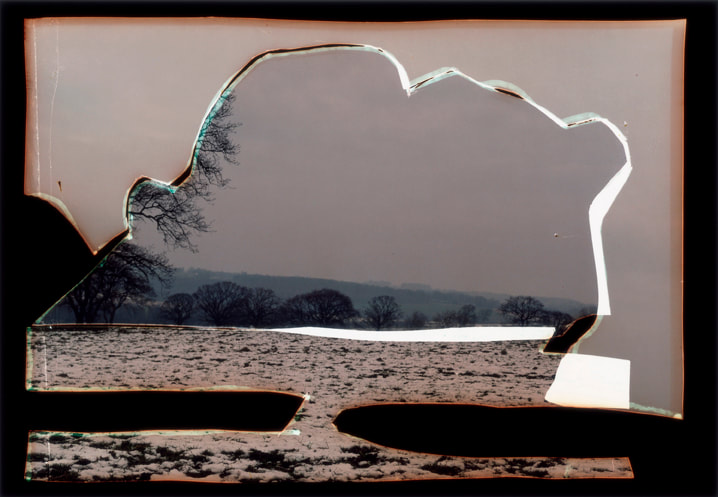
Here is one of Talmor's artworks which is part of a series called 'Constructed Landscapes'. The image appears to be a view of a desert-like landscape being seen through broken glass however it is just a collage. You can see many dried out plants suggesting part of the photo could have been taken in an area where perhaps a fire started or maybe a war. And in the other part, there is a view of more dead trees over a wide landscape of hills. These two separate images could possibly have been assembled together because they have similar themes in common, death and isolation. This is also most likely the reason why this series is called 'Constructed Landscapes' because Talmor has purposely constructed these two photos of landscapes together for a reason. Maybe to compare the similarities in different countries or climates.
Here are some more images created by Talmor.


Talmor's Workshop


During the workshop, Dafna Talmor explained why she made this series of constructed landscapes. It was to form impossible lands. This encouraged me to create the same type of images such as my second one. I used materials including cellophane, agitate, film slides, hole punchers, and markers to create the illusion of one image when in fact it is a collection of contrasting worlds.
Puzzled 'Em
This topic is about how we can make any object seem completely different just from photographing it from another angle. In other words, Puzzled 'Em.
BrassaïBrassaï was a Hungarian and French photographer born in 1899 until 1984 when he died. He created many iconic photographs during his lifetime. Brassaï created his artist name based on his hometown Brasso where he lived until 1924 when he moved to the city. Brassaï tended to capture the more difficult side of life in his images however his images also consist of his friends and acquaintances such as Pablo Picasso, Salvador Dalí, and Henri Matisse.
|
|
Bernice AbottBernice Abott was an artist who studied sculpture in New York, Berlin, and then Paris where she worked as Man Ray's studio assistant. This collaboration led her onto the path of photography where she soon became an independent photographer. Abott returned to the United States, in 1929, where she began to form her most famous, well known installation: A documentation of New York City in which she presented it from her commonly used birds eye view and "worms eye view". Since they have been taken from such extreme points of view, they can seem extremely intimidating and overwhelming to the viewer.
|
|
Practice Photo Prep


My Puzzled 'Em Game Prep
The type of game I am creating is a board game. It will be able to fold up into a square and fit smoothly and compact into a cardboard box, followed by a pack of cards with instructions of what to find on them.
Rules:
1. Place the image board in the centre of the group of players.
2. Each player takes turns to pick up a "find" card, which will say "find the image of..."
3. Once the 1 minute timer starts, players search the board to find the correct photo.
4. The player that thinks they have found the image flips the "find" card over to reveal the right image.
5. The player who finds the right image gets 10 points and the losers get 0 points.
6. Once all the images have been found the one with the most points wins.
My Images


Here is a photo shoot I took at home using items from my room. My overall theme I was aiming to keep throughout the images was bird's eye view in monochrome. In my opinion, I feel as if the 9th photograph is the most successful because I managed to keep every part of the object in line with itself due to its shape, making it easier to disguise as just a circle. Although I think the 9th image is the most successful, I personally prefer the first photo, even if it is more obvious as to what it is. The white background disorientates the viewer, causing them to not know which direction the key is facing. Along with that, the reflections from the artificial light used in the picture create, in my opinion, an underwater effect, also linking with the way the end of the key blurs out as if it is drifting away into the unknown. The monochrome also adds to the "unknown" aura as its plain black and white adds enough depth and tone however not too much to over complicate the scene.
Saul Leiter
Saul Leiter was an American artist, who also explored colour in the early stages of photography. Leiter's work often consists of specific formal elements such as focus, light, composition, and colour which makes his work brighter and more captivating. He frequently uses people as subjects in his pieces because it is clear he aims to form a grid/frame around them.


|
The image on the left distinctly represents the list of formals elements I mentioned about Leiter's photographs. This piece is somewhat unusual due to its composition where the man, in focus, looks to be standing outside a shop however is dramatically cropped, by the shadows creating dark tones, and is made to seem as if it is something like a stage with a spotlight.
The repetition used in this photograph is extremely subtle, however, quite clear to understand why it has been placed in the image the way it has. Behind the man is what looks to be a shop window sill which happens to line up horizontally with the man's shadow, the wall, and the frame of the dark box; creating an alternate type of grid, enclosing the focus of the man into a compact space, clear to see. Texture in this image contrasts strongly between the strong, rough pattern on the wall compared to the soft, blurry foreground. I feel as though keeping these specific elements true to the majority of Leiter's work is important because it represents a form of signature style that I feel Leiter had to maintain as he also experimented with colour. |
Photoshoot inspired by Leiter
|
The photos I took based on what I understood from Leiter's, in my opinion, were not as good as I was hoping them to look, for reviewing them again made me acknowledge the mistakes I made in my images. For example, I'm considering retaking the third one because it looks too blurry and as if I took it on a low quality camera because there is no chosen subject that's in or out of focus. This photo shoot was slightly rushed because my camera had a low battery however, I took as many as I could. I believe that I managed to capture most of the formal elements that usually feature in Leiter's work including light and composition.
All my images included reflections similar to some of Leiter's images above and because mine are taken on display boards with square photos on them, it has formed a subtle grid format to lay my composition on in my images. |
|


