Collect things you love, that are authentic to you, and your house becomes your story
- Erin Flett
|
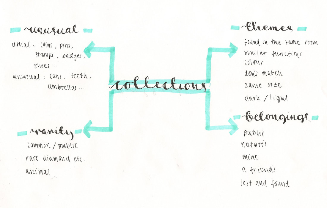
I chose the topic Collections because I find it fascinating. I enjoy discovering how many categories can a certain object fit under and how many other objects could possibly match it. Everyday I find collections all over the house such as toothbrushes, food, cushions, toys.. and even more if I pay more attention.
|
|
Lorenzo Vitturi


Lorenzo Vitturi is a photographer/ sculpter from East London. He mostly uses the art of composition as you can see in the following images consisting of moldy fruits, most of these photographs are from his popular project: Dalston Anatomy. Before photograhy, Vitturi used to be a cinema set painter therefore, when he moved more to photography, he took aspects of the cinema with him such as; props, stages, certain compositions.

In this photograph I see a large sculpture of fruits, rocks and other natural resources like wood. The abstract collection already makes an eye-catching artwork along with the bright, bold complimentary colours contrasting each other throughout the structure. I would suggest this sculpture was built, from what I can see, around the topic; everyday foods/ items because as soon as I saw this picture I could easily identify 5-6 things I see regularly.
However, there is a possibility that it could be based on another theme such as colours since I could not make out about 40% of it. I find the most captivating part of the photograph is how vibrant it is, the colour scheme actually reminds me of a market selling exotic fruits and I can sense how loud the market would be just by how loud and brilliant the colours are in this.
The fact that this is just a picture amazes me because then it starts to make you question how much effort it took to put this together, for example, looking closer at the photo you start to notice the the fruits wouldn't balance like that in real life so does that mean it all fell down after of was there another structure behind it supporting it, possibly meaning that could be another photo opportunity.
|
|
Here I attempted to recreate some of Vitturi's ideas from his Dalston Anatomy project where he curates collections of random objects and stacks/ fits them into a compact space with a rather bold background to contrast.
In the first three, I experimented with Vitturi's bold backgrounds by using bright colours such as orange, or even just using white to contrast with the bright nail polish bottles and containers in the first and third. I enjoyed taking these however, in future photo shoots, I might not photo shop the toothbrushes onto a background because it gives the picture an awkward look as it doesn't have a shadow or add any depth to it. In the second set of three photos, I tested the photographer's chaotic theme seen throughout the majority of his photographs. The way I did this was by taking multiple pictures and layering them over each other, which looks clearer in the Lego picture. In the third set of photos, starting with the collection of earrings, I tried simplifying the task down to the basic meaning of 'collections' by gathering objects belonging the same types of categories such as; perfume bottles, circles, yellow items, books, similar fabrics etc. Considering how simple this part of the task was, I think it turned out pretty well. I added a blurring effect to one to add something a little different from the others which seemed to work out succesfully too therefore, I believe the shoot went well. |


In the second photo shoot, I decided to take less photographs to ensure that each photo I took was well thought out and planned because I didn't want to repeat the mistakes I made from the last shoot. Here I have continued to layer some of the photographs on top of each other because I believe that was the feature that worked best the first time.
I also decided to experiment with fruits exactly like Vitturi did so as you can see in the image, I have attempted to almost replicate his work. One problem I faced taking that photo was the balancing of fruits, I understood from looking at Vitturi's work that it would be difficult but I wasn't quite prepared for how fast I'd have to take the picture which is why I ended up leaning them against a wall.
I also decided to experiment with fruits exactly like Vitturi did so as you can see in the image, I have attempted to almost replicate his work. One problem I faced taking that photo was the balancing of fruits, I understood from looking at Vitturi's work that it would be difficult but I wasn't quite prepared for how fast I'd have to take the picture which is why I ended up leaning them against a wall.


Todd McLellan


McLellan is a Canadian artist, born in Saskatchewan. His passion for photography blossomed from his work starting all the way back at the Alberta College of Art and Design and his ideas in photography gradually changed. Here, I have studied one of McLellan's 'Collection' phases where you can see different objects, mainly electronics, being taken apart and arranged in what looks like a very carefully thought out compostion to display all the components, piece by piece.

|
This is one of my favourite photographs by McLellan. The composition used in this piece along with the, now dismantled, item itself creates the aura that the bike had some sort of history and possibly a story as to why it has been taken apart.
I believe McLellan chose these specific compositions to reflect the original shape of the bike and maybe also reveal how many tiny pieces it takes to build an object as useful as a bike. This could, however, perhaps have connotations of the time and effort it takes for him to assemble one of his artworks. |
|
I found responding to McLellan extremely difficult, hence the number of photographs, as, funnily enough, I didn't quite know how to piece a lot of objects I found back together therefore I stuck to smaller sized items to start with. Although people do it everyday, looking back at the dismantled pens, I found certain ones more interesting than usual because I have had the chance to really analyse the pieces better.
In future photo shoots inspired by McLellan, I don't think I would photograph the shoes again as they are not as eye catching as I hoped they'd be because, compared to the original photographs, there are not many components that make up a shoe and personally I believe that its the amount of smaller, less noticeable parts that create the overwhelming and busy affect McLellan's original pieces give off. |
|


I have only continued to photograph pens in my refined response as this is the object i think worked the best. I wasn't happy photographing shoes because they weren't as interesting as I hoped they'd be therefore I chose to not take anymore pictures. In this shoot I haven't taken as many pictures as usual because i aimed to focus on the composition of the pens pieces more than the quantity of photos.
I believe these photos worked better than the last because instead I used natural light rather than the flash from a camera.
I believe these photos worked better than the last because instead I used natural light rather than the flash from a camera.
Matt Lipps


Matts Lipps is an American photographer who experiments with the line between sculpting and photography, shown in the photographs he has recently taken. He often uses a range of different medias varying from types of papers to fabric and the majority of his work focuses on portraits and people.
|
Here is my absolute favourite photograph taken by Lipps. This specific photo represents contrast and differences in so many different ways possible maybe even the photographer himself didn't even notice, starting with the most obvious aspect: colour. Although the colours in this are much less vibrant than the ones you would usually expect to see in one of Lipps' images the potential messages behind the chosen shades are still as strong, for example, the warm, relaxing aura that the orange tint gives off could imply an exotic or very hot land such as the bahamas, being contrasted with a much colder place in the world such as the UK or anywhere with a colder climate... again this is just one suggestion.
Another meaning could be shown through the animals. Yes these animals could also link to the first proposal however, I was thinking the overall message behind this photograph could go even deeper as to bringing up endangered species because as you look closer you see to the left of the image an elephant infront of the red background which could have connotations of happiness and freedom and as you move toward the right, the animals get more and more domesticated until at the very end a man is riding a horse infront of a blue background in which could possibly have connotations of sadness and the feeling of being trapped since blue is often linked to those negative emotions. |

|
|
|
In these photographs I have chosen to only respond to Lipps' collage side, not the sculpting or vibrant colours aspects. I chose just this one feature to make sure I was 100% confident in the collages I made, I wasn't happy with these because I had limited resources to work with and no real tools such as scalpels with me. This shoot wasn't a complete failure though as I managed to discover the variety of themes I could pull out of one magazine including fruits, materials, and many different body parts.
Next time I respond to Lipps I will focus on another aspect of his work on its own, most likely the vibrant, contrasting colours. |


I have continued to use the collages from the first photo shoot because in my refined response, the reason for that is because I aimed to work on the backgrounds of my work and make it as similar to Lipps' as possible. To recreate one of Lipps' collages completely, I had the idea to take my original photographs into an editing website, cut around the collages, and stick them onto all different vibrant backgrounds.. I am very happy with the outcome.


Olivia Parker
|
Parker is an American photographer who's work largely focuses on the art of still life which came around in the 17th century. Parker's work partly focuses on the beauty of life and flowers blooming and that type of art however, the majority is about life's struggles for example, not having food on your plate.
Parker's work relates to collections due to the fact she collects a variety of items from shells and flowers to bits of food. In my opinion, Parker's version of collections is the most realistic unlike Lipps for example because the majority of Parker's work have more serious messages behind them. |
|


Assessment - A Summer Afternoon
|
In A Summer Afternoon, the first thing I can make out are the shadows. I believe this aspect is the most dominant as you can easily depict a somewhat reflection of life because of the shadows of the person, the birds, the planes, and the other structures. The tones in this picture strongly contrast one another as I see the dark grey flowers drooping in front of the bold white wall, although I feel as though the photographer chose this wall not to just be a simple white wall but perhaps to reveal every imperfection and flaw to this photograph.
In my opinion, I feel as though Parker has perfectly balanced the elements; composition and space due to the fact that without the shadows standing right where they are, this picture could have potentially been quite empty whereas instead, she has chosen to place these flowers, and the objects causing the shadows, not too densely however not too spaced out to form the effect that the image seems busier than it is. I also think that since Parker has chosen to make this image monochrome, it has given it a more sophisticated aura whereas if it were in colour, the bright vibrancy of the flowers could instead give off possibly a playful or younger feel. If I were to recreate Parker's photograph, i would most likely wait until midday as it looks extremely bright in her picture and I would need as much light as possible. After waiting, I would stand and stool upside down on a table directly facing the light because from what I can see in the photo, the shadow the man seems to be standing on look like chair legs. Then finally, I would place a doll on the chair legs and lay flowers, preferably drooping, against the wall. |

After looking carefully at A Summer Afternoon and looking closely at all the details, I understand that this photograph could possibly be more than a picture, it could also be a story. Perhaps it's a way of showing a long journey Parker, or someone she knew, went on or maybe it's a documentation of what it's like living her life or wherever she was when she took that. Overall, this photograph makes me feel calm because in a way, it is similar to some views we see at home when, on a sunny day, the natural light from the sun shines through the windows, rather than a controlled light source, there's flowers blooming everywhere on, exactly like the title, a summer afternoon.
Although I have looked carefully at this image, there are still parts of it that make me question it such as: how is the plane so small yet so clear? and whats holding it up? or, did this bunch of flowers mean something to you and why are they dead? and what was your overall thought behind taking this? |


Before I took any of these photos, I added a monochrome filter to the camera so they could all already begin to reflect Parker’s style. The majority of my photos have one element in common, shadows, this is the part that caught my eye the most whilst looking at Parker’s work, therefore I chose to add it to my pictures. I believe my shoot was successful partly because I decided to take most of my pictures in bright light, both controlled and natural, therefore the contrasting tones are stronger than if I took them with a dimmer light, meaning it would most likely be more difficult to find the focal point and other bold points.


Overall this theme Collections has been extremely fascinating to me because before this, yes I knew what collections were, however I didn't acknowledge how many types there really were such as the collections of pieces as you take objects apart or the collections of moldy fruits after a food market closed up. Here are my three favourite photographs I took whilst exploring each photographer and their style and I am proud of them. I'm happy the Vitturi one is a perfect line of circles and the one thread adds a hint of somewhat controlled chaos the the mainly straight composition. The image inspired by Lipps is eye catching for its bright complimentary colours red + green and blue + orange, and in the McLellan photograph, taking apart a pen is the most similar I could get to his extrememly overwhelming pieces.
